Contra is a shooter video-game, created by Konami in 1987. The game has several editions and has its versions available for almost all the possible gaming platforms. Contra is considered to be one of the most popular and most successful shooters of all time.
Meaning and history
Contra is a legendary game released in 1987 by Konami for arcade machines. In the original game, the action took place in the year 2633 and the player fought a mob of enemies including humanoids, mutants, and giant aliens. In fact, with the release of updated versions, the essence of the game has not changed – the main plot of Contra has always been based around the confrontation between the player and the aliens who have taken over the planet.
When developing the game, Konami Studio was inspired by popular American action movies of the 1980s, such as Predator. By the way, even the first promotional posters of Contra reminded the style of the movie Predator, and the main characters of the game, Bill Reiser and Lance Bean, the developers intentionally made them look like Arnold Schwarzenegger and Silvestre Stallone.
By the way, the name Contra was initially used only for the American market. In Europe, Contra was called Gryzor, and also here all the characters were replaced by robots, Probotector was the name of a released much later version for the Pacific region and France, and there was a separate Konami version for Famicom and the Japanese market.
1988 – Today
The Contra logo is one of the most constant examples of gaming industry visual identity designs. Once created, in 1987, it was only slightly refined throughout the years.
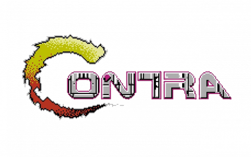
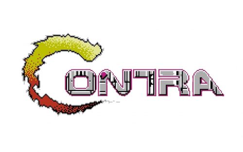
The Contra logo is composed of a bold wordmark with a graphical element, replacing the first letter “C”.
The Contra lettering in all the capitals is executed in a custom sans-serif typeface with rounded angles and straight edges of the letters. The most recognizable detail of the Contra nameplate is its letter “T”, which has its right part of the horizontal bar replaced by the letter’s “R” bar.
The “C” of the Contra nameplate is replaced by an open ring of a fire, which repeats the silhouette on an enlarged “C”.
The orange and gray color palette of the Contra logo was chosen in 1987 and by today it only gained a thicker and smoother red outline, which makes the lettering more distinct and bright.
The Contra logo is not overloaded, it looks just like it has to and is instantly recog-nizable across the globe.


