

![]() Arsenal Logo PNG
Arsenal Logo PNG
Arsenal is a famous British football club, which was established in 1886 by David Danskin. Today it is one of the strongest clubs in England and has won numerous rewards during its history, including FA and UEFA cups. Today the club is owned by Kroenke Sports & Entertainment and has Mikel Arteta as the head coach.
Meaning and history
![]()
The visual identity of the famous English football club is based on the crest of the Metropolitan Borough of Woolwich, white it was formed. And until today it stays a tribute to the roots and heritage of the iconic team.
1904 – 1922
![]()
The very first logo of the club depicts the Woolwich Borough crest with added laurel leaves on the sides. Three vertical cannons with lions heads are placed on the shield with many ribbons coming out of it, where the lettering is located.
Even after the club moved from Woolwich, it still uses a cannon, celebrating the military legacy of the area it was born in.
1922 – 1925
![]()
The redesign of 1922 brought a simpler and stronger logo, without additional ribbons and other ornate details. It was a single cannon, enclosed in a horizontal oval frame, with the wordmark under it. The cannon was facing right, to the east.
1925 – 1930
![]()
In 1925 the cannon changes its direction and gets more distinct contours and a darker shade. “The Gunners” inscription was placed near the cannon, on its right.
1927
![]()
The first red and white logo in the club’s history was introduced in 1927 and featured a stylized AFC abbreviation in a sharp wishbone style, drawn in red capitals on a white background inside a classy crest medallion with a double red and white outline, set on a solid red banner. The badge stayed active for just several months.
1930
![]()
In 1939 the cannon was put on a white shield with a thick red outline. Additional lettering was added, also in red — “A.F.C 1930”, it was executed in a simple sans-serif typeface with neat straight lines.
1932
![]()
In 1932, the main shape of the Arsenal logo was changed to hexagon. The concept of the badge repeated the one from 1927 but with some modifications. First of all, an image of a football was added to the bottom part of the crest. It was drawn in solid red with thin white stripes and stitches. Secondly, the date mark “1932” was written under the ball. Thirdly, the contours of the AFC abbreviation were cleaned up and strengthened.
1935 – 1936
![]()
The redesign of 1935 has made the lettering inside a white hexagon with a red outline look super sharp and modern. With straightened contours of the characters and pointed ends of the bars, the abbreviation got a sleek and powerful look. The image of a football was now placed in the center of the composition, inside the negative space of the intertwined letters.
1949 – 1990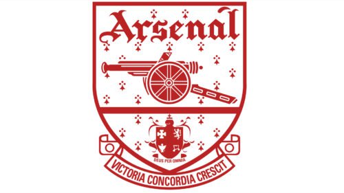
The redesign of 1949 brought a Victoria Concordia Crescit to the club’s visual identity. It was a shield, executed in a red and white color palette, with the legendary cannon, facing west, and the “Arsenal” wordmark in the gothic style font above.
1949 – 1950
![]()
In 1949, the team was using the same badge as in 1935, with just one difference — the datemark at the bottom of a white hexagon was changed to “1949 — 1950”. All the other elements remained absolutely untouched, as well as the intense red and color palette of the logo.
1951 – 1952
![]()
For the season of 1951/1952, the same badge as in 1949 was used by the Arsenal Football Club. A stylized red abbreviation on a white hexagon with a double outline, a red football with white stitches — all of the elements were repeated with no changes. Just the datemark, placed at the very bottom of the composition, was changed to “1951 — 1952”.
1967 – 1978
![]()
The cannon image from the logo, created for the club in 1925, came back to the AFC visual identity in 1967, with some significant modifications, of course. It was now drawn in clean and distinctive white lines against a solid red banner without any additional lettering. This version of the logo stayed with the club for more than ten years.
1971
![]()
The redesign of 1971 has changed the color palette of the Arsenal logo to blue and white. The cannon was redrawn in thicker lines against a plain white background without any framing. The main image was accompanied by a large classy “1971” datemark in an elegant font, arched at the bottom, and a silhouette of the cup, drawn in blue above the cannon.
1978 – 1979
![]()
In 1978, the logo, introduced in 1967, got some minor changes: now the cannon was not the only white element of the Arsenal badge. Three lightweight sans-serif characters, AFC, were now written on the left of the cannon, with each letter outlined in a circular frame, which made them look like three cannonballs.
1985
![]()
Another version of the Arsenal badge was designed in 1985, fully based on the previous logo. It was an anniversary banner without any additional white cannon and three cannonballs placed on a red background and accompanied by a bold uppercase “Centenary Year” inscription in serif font arched on the top and the “1985” datemark at the bottom.
1990 – 1994
![]()
In 1990, the ornate logo, created for the Arsenal FC in 1949, was reworked. The concept and style remained untouched, but the new color scheme made the badge look completely different. Now, the background of the crest was painted in red, while all small elements and the lettering were set in white. As for the cannon, the central element of the logo, it was redrawn in red and white and underlined by a thick dark-green ribbon. The same shade of green was used in the classy coat of arms, placed at the very bottom of the Arsenal shield.
1994 – 1995
![]()
In 1994 the crest changed the color palette and was put on a black background in order to gain more strength and solidness. Now the shield was red with white contours and lettering on it, there was also “The Gunners” nameplate added above it, in a red rectangle with a thin yellow framing.
1995 – 1998
![]()
In the version from 1996, the rectangle of the gunners was removed, and the inscription is now placed on a black background, right above the shield. Not much was changed on the shield itself, just the contours were refined and the Borough of Islington’s cost of arms on its bottom part was now more bright and visible.
1998 – 2001
![]()
The redesign of 1998 has modernized the badge by enlarging the red crest part, removing “The Gunners” lettering from the composition, and changing the shade of blue to a lighter one. The golden frame of the crest became thicker and brighter, creating a stronger contrast between the layers.
2001 – 2002
![]()
In 2001 the logo was redesigned again. The lines and letters on the red shield are now colored gold. All the elements are enlarged — the gold cannon, green and red crest and the gothic lettering on the top. As for the “Victoria Concordia Crescit” inscription on the ribbon under the shield, it also gained a more modern look and is now written in a bold sans-serif, using red capital letters.
2002 – Today
![]()
The completely new style was brought to the football club’s visual identity in 2002. The logo we all know now was designed, and the new color was added.
It still is a tribute to the heritage and history of the club, but in a modern and powerful way now. The bold gold cannon, facing right, in the largest part of the badge. It has a delicate white outline and comes out of the blue and white frame of the shield.
The “Arsenal” lettering is drawn in white with a gold outline. It is executed in a bold and elegant sans-serif typeface, which is very close to Clear Gothic TS DemiBold and Monotype Clearface Gothic fonts, but with modified lines, creating a unique and memorable style.
The new emblem has no ribbons and crests on it, it is minimalist and laconic, reflecting the powerful and influential club.
2005 – 2006
![]()
For the 2005/2005 season, the Arsenal crest, introduced in 2002, was placed on a dark brown background and was accompanied by the uppercase “Highbury” wordmark in golden characters arched on the top and the “1913 — 2006” datemark written in the same style — at the bottom.
2011 – 2012
![]()
In 2011 the special anniversary logo was designed, to celebrate the 125 years of the club’s history. The stylish shield was decorated with a laurel wreath and ribbons, where “1886” and “2011” was written. The two parts of the wreath were connected by the “Forward” inscription. It is a brilliant representation of strength, progress, and development.
Symbol
At the beginning of the 1926/1927 season, a new Arsenal symbol was adopted. While it also used the cannon theme, it looked entirely different now. The Cannon was narrower, and it was pointing backward. It’s not known what the inspiration for the design was, yet there’s a remarkable similarity between the cannon on the logo and those depicted on the crest of the Royal Arsenal Gatehouse in Woolwich. The logo was in use for 17 seasons, with several subtle modifications. Moreover, the narrow cannon has actually stayed the club’s most important symbol.
In 1949, the so-called Victoria Concordia Crescit logo made its debut. It featured the narrow cannon inside a shield shape with the lettering “Victoria Concordia Crescit” beneath. The words were Marksman’s motto that impressed the players so much that they decided to make it a part of the club’s identity. The logo also included the word “Arsenal” in an intricate gothic font. The smaller shield that could be seen under the cannon comprised the coat of arms of the Borough of Islington.
While the logo was definitely an essential part of the club’s identity, it was only in 1990 that it was used on the kits for the first time.
Emblem
By the end of the previous century, it became obvious that the club needed to update its logo and make it more in line with contemporary design trends. So, in 2001, the Arsenal emblem went through a modification. As a result, the gold gradient was replaced by solid yellow, while the intricate font used for the lettering became much simpler.
Font
While the FC font looks very much like the Clearface Gothic Medium type, the glyphs have been customized to fit the space and the overall concept of the logo. The Clearface Gothic type was developed by Morris Fuller Benton in 1984.
Colors
Today, the main team colors are red, gold, blue, and white.
RED
PANTONE: PMS 2347 C
HEX COLOR: #EF0107;
RGB: (239, 1, 7)
HSL: (356, 90, 49)
CMYK: (0, 100, 97, 6)
DARK RED
PANTONE: PMS 2035 C
HEX COLOR: #DB0007;
RGB: (219, 0, 7)
HSL: (355, 92, 44)
BLUE
PANTONE: PMS 294 C
HEX COLOR: #063672;
RGB: (6, 54, 114)
HSL: (213, 90, 24)
CMYK: (95, 53, 0, 55)
GOLD
PANTONE: PMS 4505 C
HEX COLOR: #9C824A;
RGB: (156, 130, 74)
HSL: (40, 33, 46)
CMYK: (0, 17, 53, 39)
WHITE
HEX CODE: #FFFFFF;
RGB: (255, 255, 255)
CMYK: (0, 0, 0, 0)


